Table of Contents
A Walk Through on How to Create Visual Tabs in Power BI
Introduction
I recently was faced with a situation where I was creating a Power BI report that required the user to be able to see a lot of data on a single report page. Now, how can I allow the user to view reams upon reams of data all on a single report page? I started thinking back to my previous work with Flexdashboard R package that allows you to create tabs of visuals that the user can easily switch through! This got me thinking on how to create visual tabs in Power BI.
Tab sets can be a wonderful solution for these types of situations as they allow the user to view a lot of different tables and visuals in a compact space. Unfortunately, as far as I know, there is no vanilla Power BI function that allows you to quickly build the tab sets. Many people resort to some complex DAX coding to achieve these results.
The good news however, is that the tabs can be quite easily created within Power BI by using buttons and bookmarks!
This has inspired me to create this step by step guide on how to create Power BI visual tabs. So, if you are interested in finding out how to do that, make yourself comfortable, grab a cup of coffee and read on!
Overview of How to Create Visual Tabs in Power BI
Essentially, our main approach will be to create bookmarks recording the state of the report with each bookmark marking different visuals as visible. We will then link the buttons to the bookmarks, allowing the user to flick through the visuals.
What are bookmarks you may ask? Well, bookmarks in Power BI are essentially a way to record the current state of the report. It is almost like taking a snapshot of the report and saving it. Of course, it is not quite like that, as all the visuals remain interactive, but you get the point!
So, let’s dive in!
This is how to create visual tabs in Power BI:
- Pull data into Power BI and create the visuals we need
- Position the visuals and hide them
- Create buttons for each set of visuals
- Create bookmarks for each visual tab
- Assign buttons to each bookmark
Pull data into Power BI and create the visuals we need
So, first, let’s create some data to illustrate the point. Then we will pull that data through to Power BI to create some visuals.
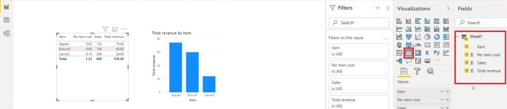
So, let’s fire up Microsoft Excel and create some data! Imagine we are selling three food items: Apples, Carrots and Broccoli. Let’s knock together a sales table in Excel as below.
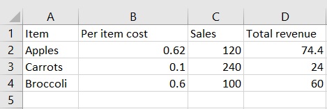
So, we have an excel table consisting of 3 data rows and 4 columns. The numbers and items don’t matter much, so feel free to put in whatever you like! The revenue was calculated by multiplying per item cost with the sales number.
Now that we have some data, open up Power BI Desktop. If you don’t have Power BI yet, download the free version of Power BI Desktop from the Microsoft Power BI website. Now we need to pull the data we just created into power BI. To do this, click on Get Data on the top bar and in the menu that pops up select Excel.
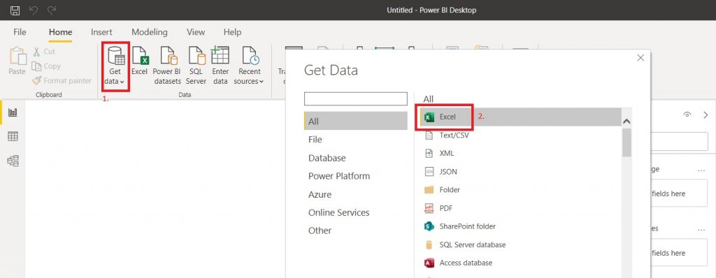
Then press Connect and select your Excel file. Once you do that, you will be met with a navigation menu. Here you can specify exactly which sheets you want to pull through, so let’s select our sheet and load it up!
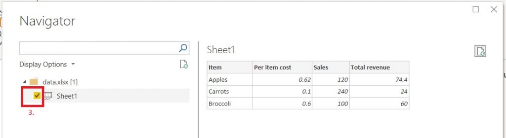
Now on the right-hand side menu, you will be able to see our data sitting comfortably with all the columns showing.
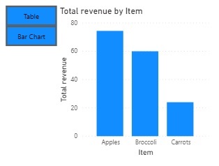
Let’s quickly knock together a table by selecting a table visual option and selecting all the columns from our data. Then we can proceed to generate a bar chart by selecting the clustered column visual and selecting item and total revenue columns.
Now we have data and visuals to play around with! Next we have to position the visuals correctly to create tabs that we can switch between.
Position the visuals and hide them
Now that we have our data in place and some visuals to illustrate the key values, we can begin creating the tabs.
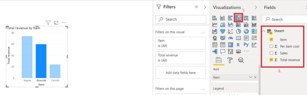
In order to create the tabs, we need to position the table and visual where we want them. For this purpose, we can place visuals wherever we want. However, since we are going with the scenario of trying to fit the visuals in a small space, let’s simply drag the visuals on top of each other. This will allow us to switch between visuals in a single spot, making the best use of the space we are given!
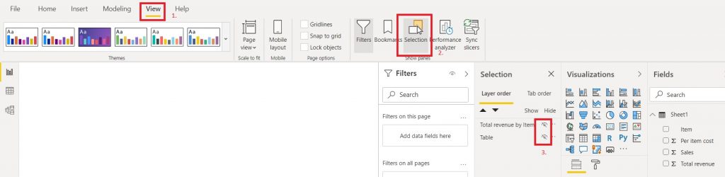
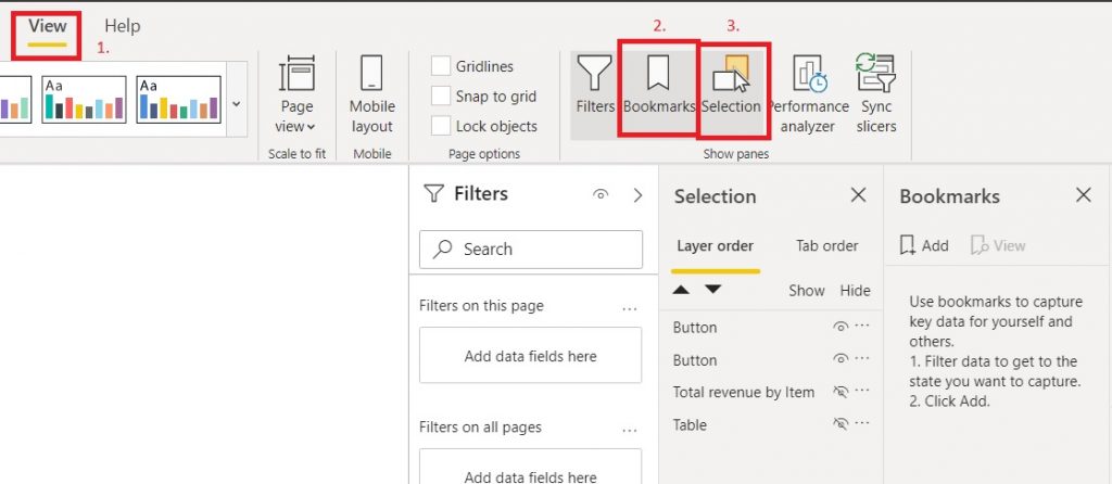
Once the visuals are nicely aligned on top of each other, we want to hide both of them. This will be very helpful once we start playing around with the bookmarks. To hide the visuals, we want to jump over to the view ribbon, where we want to enable the selection pane by clicking on the selection option in the Show Panes category. Once you see the selection pane pop up, you will see both of our visuals listed there. We can then go ahead and click the eye icons next to them and watch our visuals vanish.
Create Buttons for Each Set of Visuals
Now that our visuals are sorted and aligned, we can create buttons that we will use to switch between the visuals. We are getting there!
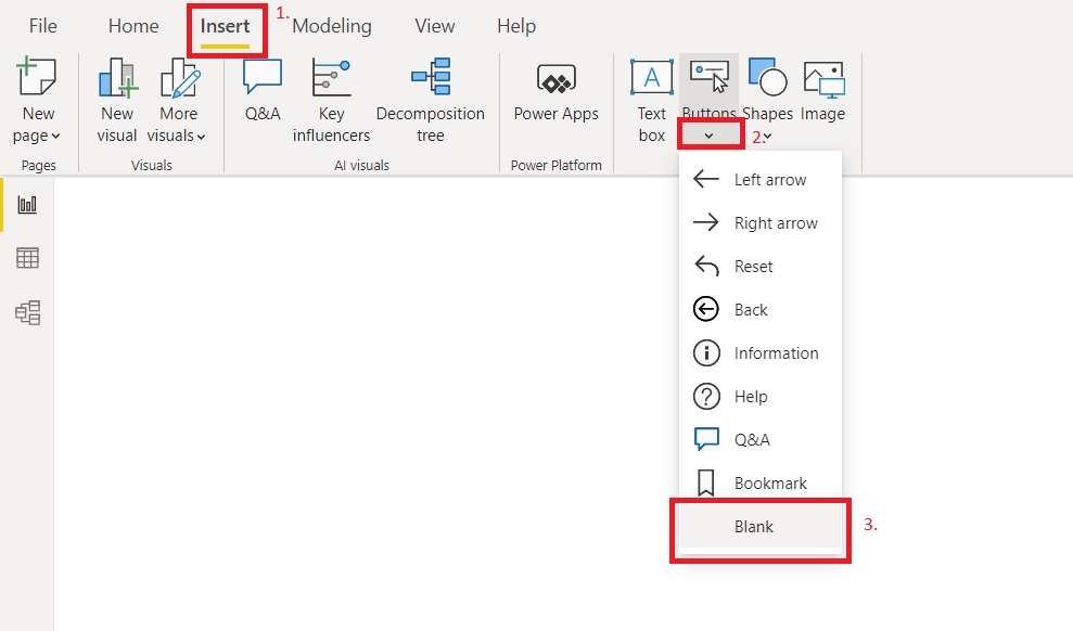
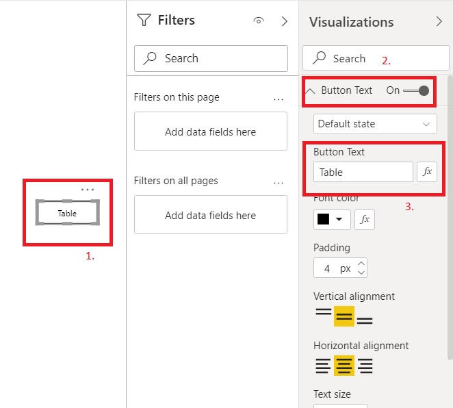
To achieve this, we need to go to the insert ribbon. Once there, open up the button menu in the elements category. We definitely want to use a blank button, as those are incredibly versatile and customisable, which is perfect for our needs!
Now we can see the outline of the button, but it seems as though the button has no background, or text labelling. Let’s sort that out next! To format the button, click on the button and you will see a bunch of options in the visualizations pane on the right. Switch on the button text option and let’s enter “Table” as a text for our first button.
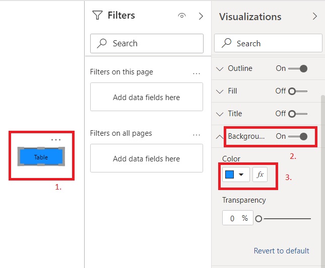
Similarly, let’s give the button some background, so users can see what they are clicking! To do this, click on the button again, and switch on the background option in the visualization pane. Then select any colour you like.
Once we are done with that, let’s do the same for the button for the second visual. Now we have two buttons and two hidden visuals. Everything is set in place for us to start working on the bookmarks. Almost there!
Let’s arrange buttons into positions to make our tabs and let’s see what we have. For the visualisation purposes, I made the visuals visible again, just to show what we have at this stage.
Create bookmarks for each visual tab
Ok, now that we have all the visuals and buttons in place, we need to set up bookmarks for each “state” of our report. We are going to keep it simple and have two states. One with the table visible and the other with the graph visible.
This may seem a bit complicated at the beginning but don’t worry, I will walk you through it step by step.
First things first, we need to have both the selection pane, as well as the bookmark pane visible. To do this, head over to view ribbon and switch them both on in the show panes category. We should see the 4 elements in the selection pane and nothing in the bookmark pane.
The way bookmarks work is quite straightforward in theory, but can get a bit clunky in practice. You set the page up exactly how you want it to look and when you press add bookmark, the bookmark saves your report as is. By default, bookmarks affect all visuals, though you can set them to affect only selected visuals which is important if you are using drill through pages.
Knowing this, let’s create our first bookmark! Unhide the table visual from the selection pane and press add bookmark on the bookmark pane.
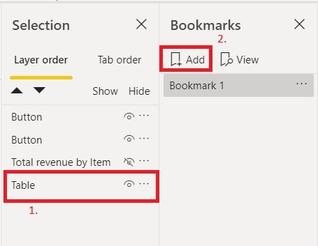
You should now see the table but not the chart. Well done! This is the first bookmark.
Now we need to create the other bookmark. This time we need to make the chart visible and hide the table before we press on the add bookmark button again.
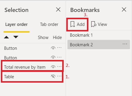
Now you should see the chart, but not the table. Moreover, if you click on the bookmark labels in the bookmark pane you should be able to switch between the table and the chart visual.
Nice! So now we have the whole set up working, we just need to get the buttons to point at the correct bookmarks.
Assign buttons to each bookmark
In order to assign button to bookmarks, click on the button. Then in the visualization pane switch action on and then select the bookmark for type and the correct bookmark for your button.
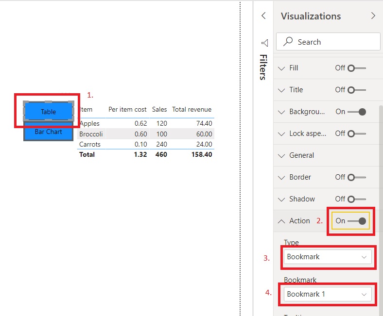
If everything went well you can now use the buttons to switch between bookmarks. All done! If you are using Power BI desktop you can use Ctrl + click to test the buttons.
As you can see, this is a simple way in which we can make our visuals more compact. At this point the guide is over, however if you would like some pointers on using this method with the drill through pages, read on!
How to create visual tabs in Power BI on drill through pages
The overall method to create visual tabs in Power BI on drill through pages is mostly the same, with a couple minor tweaks. When you create the bookmarks, select ALL the visuals that are involved in the tab set. You can do this easily by opening selection pane and Ctrl + clicking every non-button visual. Then right click on your current bookmark and select selected visuals. Once you have done that, right click on the bookmark again and select the update option which will update your bookmark.
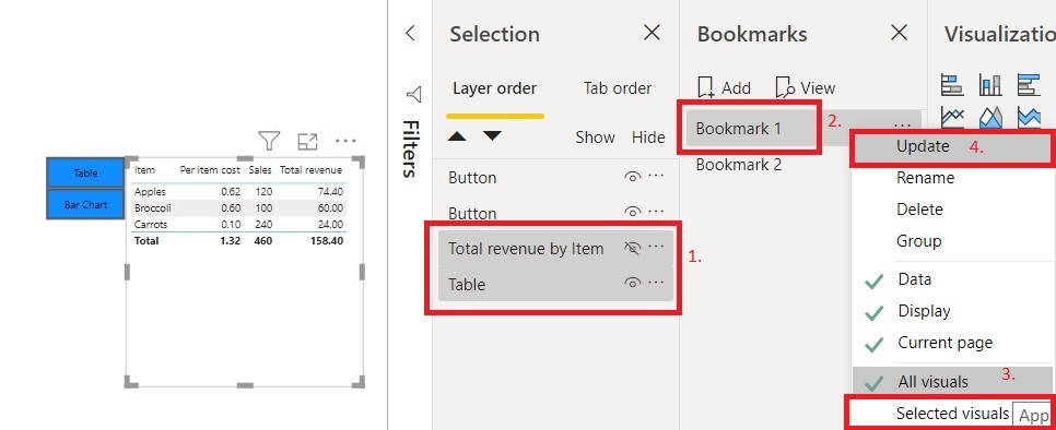
I find this method allows you to drill through on the correct element in the tab sets. Leaving all visuals affected usually retains the element you used to create bookmarks, not the element you are currently trying to drill through on!
I hope you found this guide on how to create visual tabs in Power BI helpful and if you have any questions, get in touch!