
Table of Contents
Data Based Analysis of Election Spending
Introduction
Ahh the election period. Numerous candidates vying for those all-powerful seats in the parliament (or whatever your country’s equivalent is called). In fact, it is clear all these candidates are bending over backwards for your vote, as this is evident by the steep and rising costs of the elections. US congressional elections in 2018 came with an election spending bill of over $5.7 billion dollars! This number is insanely high considering that these election costs were higher than the GDP of entire countries such as Fiji, or Montenegro!
Clearly political parties are spending huge amounts of money to run election campaigns. The money goes towards advertising, hiring campaign stuff, purchasing data to better target campaigns and more. But the question is, why are politicians spending so much cash? Is that money helping them secure seats and the power that comes with them? Is it really THAT important to outspend your opposition to grab that win? How expensive is it for a political party to secure a seat? Is that cost the same for each political party in each country?
These are the questions I will be looking to explore and answer in this post using data. So, without further ado, let’s dive in!
Election Spending is Increasing Over Time
To have an initial overview of the election costs, I have collated election spending data from 11 countries and converted all the costs to US Dollars for a fair comparison. The conversions are based on the average conversion rate for the year in which the election has occurred.
I picked the countries in such a way to get a good mix of economies and locations. Of course, I focused on countries with a (more or less) functioning democracy for obvious reasons. Different countries are governed by different election spending laws; hence the pick of these particular countries is heavily influenced by the transparency and accessibility of election spending data. In many cases I found it difficult to find, or access countries’ election data, especially if I did not know the country’s language.
Elections are done differently in various countries. For example, some countries have multiple rounds of elections, where candidates need to pass from one round to another before competing in the final election. In such cases I focused on the initial rounds with full sets of parties. Thus, please bear in mind, this data is not complete enough to develop a rock-solid conclusion passing scientific rigour. However, we do have enough data to play with and make some fascinating observations, so let’s crack on!
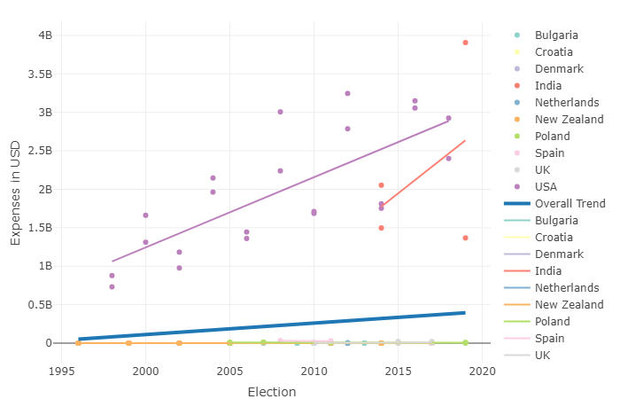
Basic Election Spending Graph Interactive Version
As we can see, the overall cost of elections keeps rising over time, with countries like USA and India, leading the trend with rapidly growing election costs. In 2019 Lok Sabha (parliamentary) elections in India claimed the top spot for the world’s most expensive election with the BJP party spending an equivalent of $3.9 billion US Dollars!
Now, the question is, why are election costs rising over time?
There are many factors involved. One explanation would be due to the rise of new media of communications, like social media and the increased use of the internet. This would mean candidates need to pour money into those media to attract new (especially young) voters, whilst maintaining their presence in more traditional ways of campaigning via rallies, radio and TV.
Another contributing factor here could be simply the general growth of the world economy with businesses, including political parties getting richer, with more cash to splash on campaigning to gain an advantage over the opposition, who in turn also have more money to spend on campaigning and the race becomes a case of parties “one-upping” each other over election spending and gaining exposure.
Our world is also beginning to see the 4th industrial revolution, with data being an ever more important asset for businesses, as well as political parties. The now ever present need to buy and effectively leverage available data could also contribute to the rising of election costs.
The final argument that could explain the rise in election costs, could simply be the rise of population. There are simply more people living in the world that respective political parties need to reach out to whilst campaigning. We will explore this further.
Interestingly, whilst USA and India saw huge increases in election spending over time, this trend is not so apparent in Europe. In many European nations, election costs are much more stagnant and in some countries like Poland, elections got cheaper.
This could be caused by many European nations introducing limits on election campaign spending. For example, Poland, UK, Spain and Latvia all have strict limits on election spending according to IFES Political Finance . This seems to be very effective at combating the ever-increasing election costs, and may perhaps force parties to embrace more efficient campaigning methods resulting in election cost stagnation and reduction in many cases.
It is worth noting that rather unsurprisingly, countries with lower populations, show lower election costs in general. This combined with the possible effect of the growing population on the election costs has prompted me to analyse how election costs over time compare once we normalise these to country population.
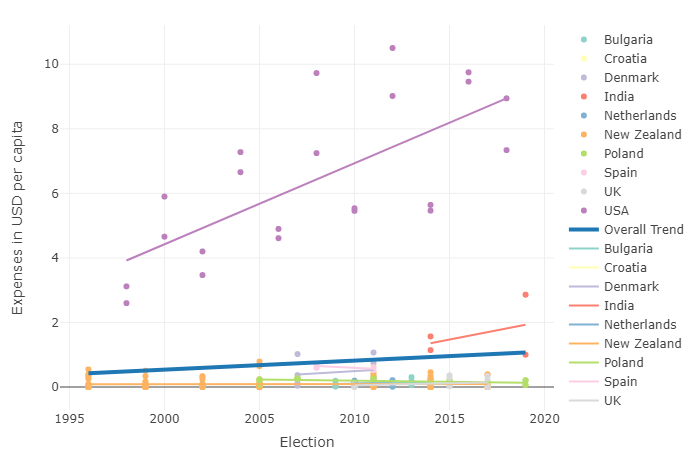 Basic Election Spending Graph Corrected for Population Interactive Version
Here I normalised the previous graph to each country’s population, by taking election expense data and dividing it by population data for each country for the respective year. The data is interesting indeed! It seems like overall trend for election costs did not change drastically.
This would imply that election costs are rising and cannot be fully explained by the growing population. If election costs were solely dependent on the population, we would expect to see the lines flattening out, where election cost per person living in the country would be more or less the same every election.
The data suggests that other reasons are responsible for the increase in election cost, perhaps those previously discussed. Interestingly though, now we can see a big change in one of the two big spenders. When we take the country’s population into account, India’s election expenses are drastically lowered when compared to other countries. Whilst still remaining on the higher end of the scale, these expenses are not as crazy high as it would seem from the previous graph! The graph also shows us that European nations still keep their election costs low compared to USA and India, despite costs being normalised to population. This could come down to expense limitation, where in some countries expense limits are set per eligible voter.
Election spending is correlated with increased share of votes and seats
So, from previous graphs we learnt that election costs in general tend to creep upwards. It is apparent parties try to spend as much as possible on election campaigns, to the point that many governments enact laws to curb excessive spending. But is this intensive spending bringing any results? If a party spends more, will it get more votes and seats? Let’s look at the data to help us answer these questions!
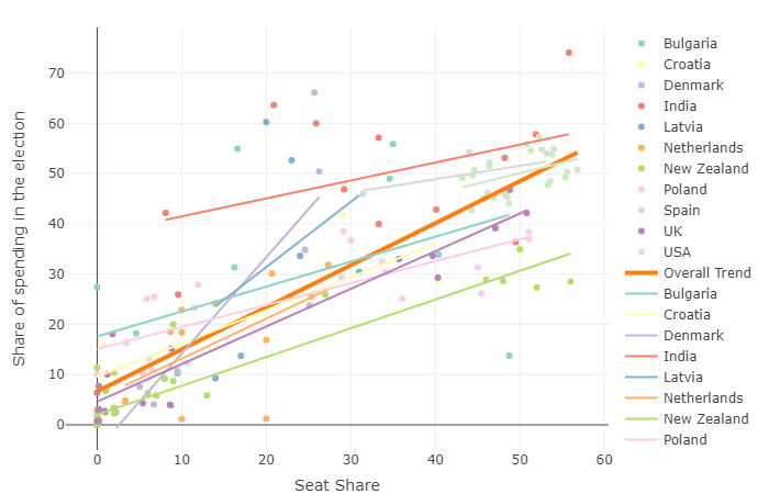 Election Spending vs Seats Graph Interactive Version
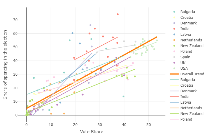 Election Spending vs Votes Graph Interactive Version
I created the two graphs shown above. One graph compares election spending to seat share gained by the party, the second graph compares spending to vote share acquired by the party in a given election. It is important to look at both graphs here, as electoral systems differ between countries. Not every country implements proportional representation.
For example, UK famously uses first past the post system where winning candidate in each area (constituency) goes on to gain a seat in parliament, rather than seats being assigned based on the overall percentage of votes for the party. These quirks in differing political systems could potentially lead to different results. To illustrate this better, imagine two parties. Party A and party B are taking part in elections. In every area of the country Party A gains 51% of votes and Party B 49% of votes. Under true proportional representation system, Party A would have 51% of seats and Party B 49% of seats. However, in UK style first past the post system, party A would have 100% of seats, as in every area, party A candidate would win and take a seat in parliament.
You can see how such differences could lead to different results. Also, note how we are measuring the share of expenses by each party, in each country for each election. This was done for two reasons. Firstly, it was done to normalise the results for each country, where overall spending values are vastly different between countries as shown previously. The importance of expenses is relative to what other parties are spending.
The second reason for this decision was more practical. This was to do away with the need for currency conversions, as some conversion data was missing for some countries e.g. Latvia. Also, historical data for currency conversions sometimes did not go as far back as historical election data. Thus, this decision has allowed me to incorporate more data.
Anyhow, I have said enough about creation of the graphs. Let’s get to the point!
So, first and foremost, we can clearly see a clear trend both in terms of seats, as well as votes. It is apparent that overall, the higher share of spending results in attaining a higher share of votes. This trend right there explains why parties spend so much effort and money to run election campaigns. There doesn’t seem to be many drastic differences in the graphs in terms of seat share and vote share. This is interesting, because it implies that this relationship tends to hold true regardless of quirks of differing electoral systems.
One interesting thing the graph shows us is that parties in Denmark and Netherlands show relatively steep gradients compared to countries such as USA and Bulgaria. This means increases in shares of seats and votes, as share of spending increases are more pronounced in Denmark and Netherlands. The peculiar difference here is that former two nations have multi-party systems, whereas the latter two focus on the two major parties.
Could this mean that multi party systems result in a stronger value for parties’ spending? Perhaps! This would suggest that in a multi-party system, people have more parties to choose from that could potentially win and are more easily swayed by each party’s offer. People are able to choose a party with beliefs that are closely matched with theirs. This means that the party which can present its beliefs best and reach out to people will get a lot of return for the money they spend.
On the other hand, states where realistically speaking competition occurs between only two major parties such as Democrats and Republicans in USA, do not present much choice and people are already aware of both parties’ beliefs. In those states it often becomes a case of voting for one party purely because they are “not as bad as the other guys”, even though party’s beliefs may not match individual’s beliefs completely. This type of vote could perhaps mean that even if parties pour in a lot of money into an election, they may not see quite as much of a return in terms of votes and seats.
However, we need to take this with a grain of salt, as not all data shows the trend. For example, UK, according to our theory with two/ two and a half party system and first past the post electoral system that encourages tactical voting, should show a shallow gradient. UK however, shows a perfectly average gradient closely following the overall trend line. Moreover, we would need much more data to explore this issue in a more conclusive manner.
This leaves us with one more question, do big, major parties have to spend more, or less to win each seat? In other words, we need to talk about the cost per seat.
Major Parties Enjoy Lower Costs Per Seat
Whilst it is clear from previous data that major parties spend much more money compared to their smaller counterparts, does this mean these parties spend more for each seat won? To explore this issue, I prepared a graph below.
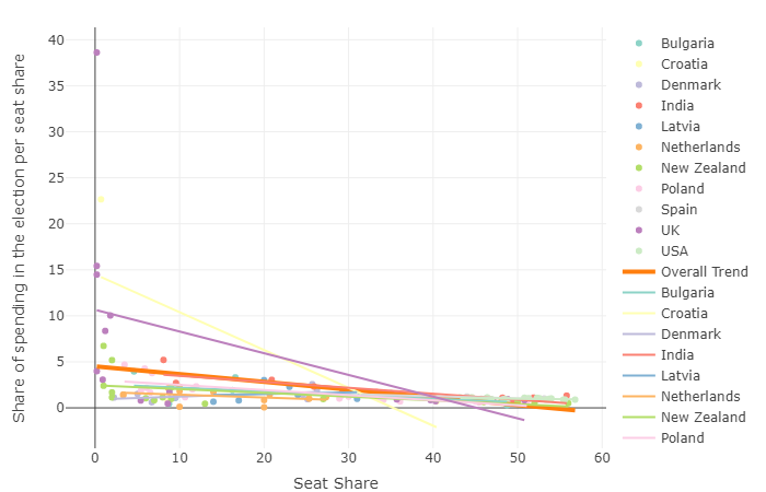 Election Spending Share Per Seat Share Interactive Version Interactive Version
Now, this graph may look confusing at first, but bear with me! The graph plots spend share per seat share in the y axis and seat share won in this particular election in the x axis. In other words, we are plotting the cost per seat, against seats won. You may wonder why I chose to plot such a graph. With the x axis i.e. seat share won, we are trying to distinguish major parties from minor ones. Generally, the major parties will win more seats than minor ones. This means we can tell those apart by tracking seat share won. On the y axis we are measuring the cost of each seat. Due to considerations mentioned previously I decided to use share of expenses per share of seats as a unit of measure.
So, what does this graph tell us?
The graph clearly shows us that the major parties tend to have lower costs per seat. This would make sense, as these parties are much more established and are already given plenty of exposure, without even considering any targeted campaigning.
Also, since bigger parties probably submit bigger orders to printers, media etc. they can leverage the sheer size of order for lower per-unit price. Interestingly these advantages were not overcome with any potential anti-establishment appeal of the minor parties. For example, British UKIP party tried to gain seats with a relatively large spending on multiple occasions. However, as you can see on the graph this resulted in huge costs per seat for the party with very few seats gained.
Conclusion
So, at the end of the day, what did we learn from analysing our data?
We learnt that due to a range of factors, election costs are increasing over time, however this is not a universally true statement with many countries experiencing stagnant, or lowering election costs.
We discovered that there is a good reason for parties to splash cash for a campaign, as campaign spending is correlated with the election results.
Finally, it is clear that the major parties enjoy lower costs per seat won, compared to the minor parties.
This was a fascinating data story to develop and tell. However, this could not happen without some amazing people developing all the necessary datasets to carry out this analysis. Below I will cover the sources used and some limitations associated with the used data.
Data Sources
As I firmly believe that every good story starts with data, let’s have a look at what data I managed to find and use in this project.
First and foremost, I had to find election spending data.
Now, this was quite challenging as I couldn’t find any reliable source that would have centralised data containing election spending figures for elections in different countries. This meant I had to use mostly government/ European Union websites for each country with some media sites. What made this task even more difficult was that often in order to find spending data for some countries, you need to understand the country’s language. Moreover, countries follow various laws when it comes to reporting election costs, so availability and quality of data was heavily restricted at this stage.
This stage was certainly a big learning point for me, as it made me appreciate the importance of centralised and high-quality datasets like some of those we are about to discuss.
See the table below for sources used for spending data:
For election results, I used Wikipedia articles, as those are easily accessible, reliable (as far as election results go) and copied data comes out in a similar format every time.
The next big task was to convert all the spending data to US Dollars. This task was made so much easier by the fantastic people over at Investing.com UK. The site contains tons of historical data on currency conversions. Additionally, the data can be easily downloaded for free! As far as I can tell this is a very complete and reliable dataset.
The final big task which involved external data was to normalise election spending to each country’s population. Here I used the beautiful dataset crafted by Worldometer. This website is an absolute treasure trove for any budding data scientist, or analyst! The site contains huge amounts of various demographic data, especially regarding world and country populations. The datasets are very complete and if you have some cash to splash you can obtain access to one of their many APIs.